Rebranding Visit the Nordics
Visit the Nordics started as a travel agency targeting the Portuguese-speaking audience. It was then called Países Nórdicos. As the business expanded, English-speaking customers became the company’s focus audience. A full rebranding was necessary.
QUICKLY jump TO ANOTHER SECTION:
Target Audience
Visit the Nordics – visitthenordics.com – is an online travel agency (OTA) that offers curated tours and travel experiences across the Nordics, including Iceland, Norway, Svalbard, Finland, Sweden, the Faroe Islands, Greenland, and Denmark.
Visit the Nordics’ target audience includes:
Tailor-Made Travelers – Those looking for customizable itineraries, whether for self-guided road trips or guided tours with expert insights.
Adventure Seekers – Travelers interested in unique outdoor experiences such as exploring the Norwegian fjords, witnessing the northern lights, or engaging in Arctic expeditions.
Cultural Enthusiasts – Visitors eager to immerse themselves in Nordic traditions, folklore, and history.
Nature Lovers – Individuals drawn to the region’s breathtaking landscapes, from Iceland’s geysers to Finland’s forests and Denmark’s coastal scenery.

Competitive Landscape
Visit the Nordics encounters other travel agencies and tourism platforms that specialize in Nordic destinations as direct competitors, including:
Nordic Visitor, VisitNordic, Guide to Iceland and National Tourism Boards – organizations such as Visit Norway, Visit Iceland, and Visit Denmark which offer official travel resources and compete in attracting travelers to their respective countries.
Visit the Nordics differentiates itself by offering customized travel experiences with a strong focus on immersive journeys, local insights, and flexible itineraries tailored to various traveler preferences.
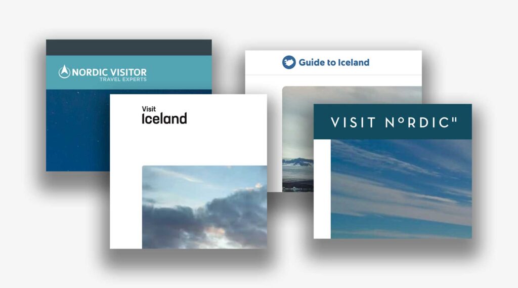
The color blue seemed too be a common denominator to all those brands.
Then let’s try something different.
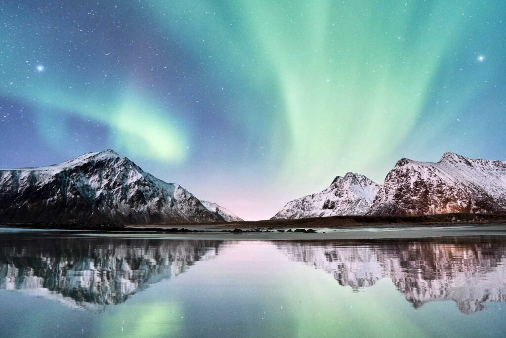
The Nordics are known for their dramatic landscapes, pink sunsets during the Summer and the presence of the Northern Lights during the Winter nights.
Logo Design
Visit the Nordics’ logo mixes the bold attitude of a fresh travel agency who dared to choose pink – a color which can only be worn by those whose personality is well defined – with the fluidity of the waters, the sharpness of the mountains and the magic of the Northern Lights.

Website
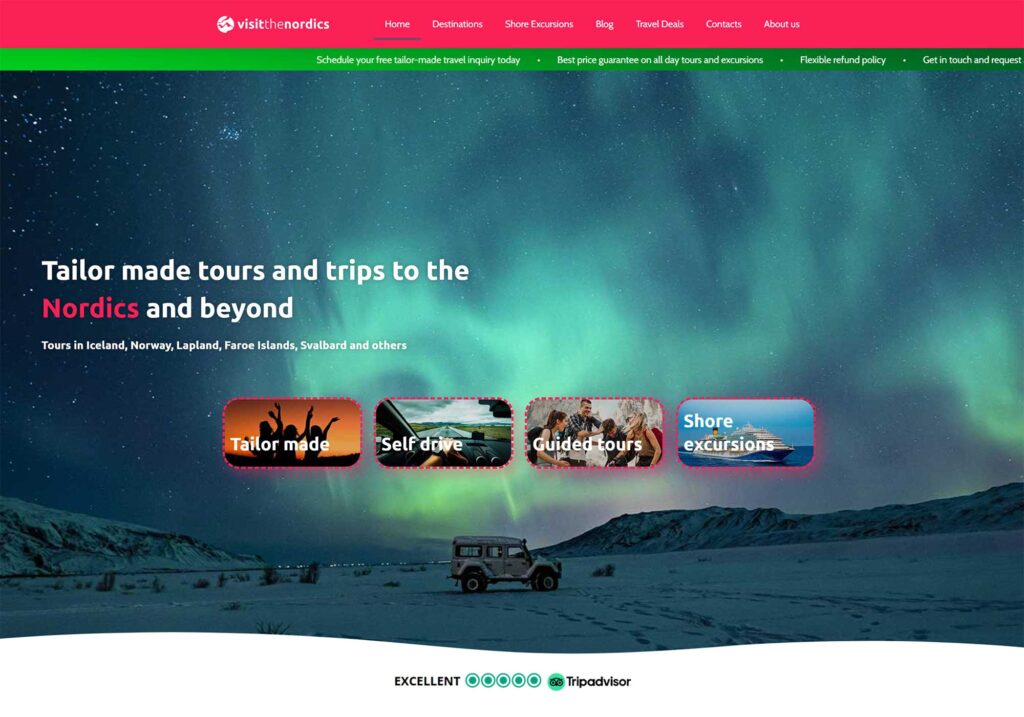
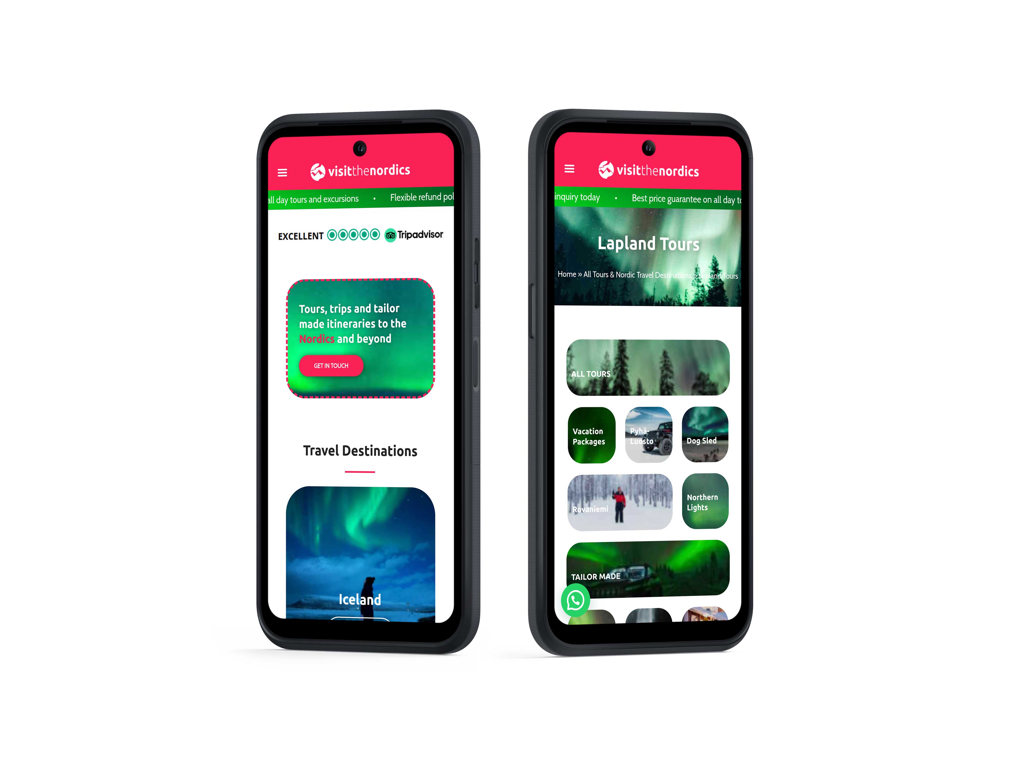
Visit the Nordics‘ website is a hub which features a marketplace for activities, trips and tours in the Nordics, a hub for Shore Excursions, a starting point for their customers’ tailor-made trips, a blog about the Nordics and, last but not least, it is their company’s main showcase method.
With such a diverse business model, the website’s navigation could have become confusing and complicated. To avoid that, the website was divided in clear sections and pages were linked in between themselves to guarantee a smooth yet circular flow.
Information Architecture
The website was divided in clear sections, all accessible from the home page. The main objective was to get people to book a tailor-made trip by getting in touch with the support team or to direct them to the marketplace so that they’d be able to pick from a choice of tours and activities themselves.
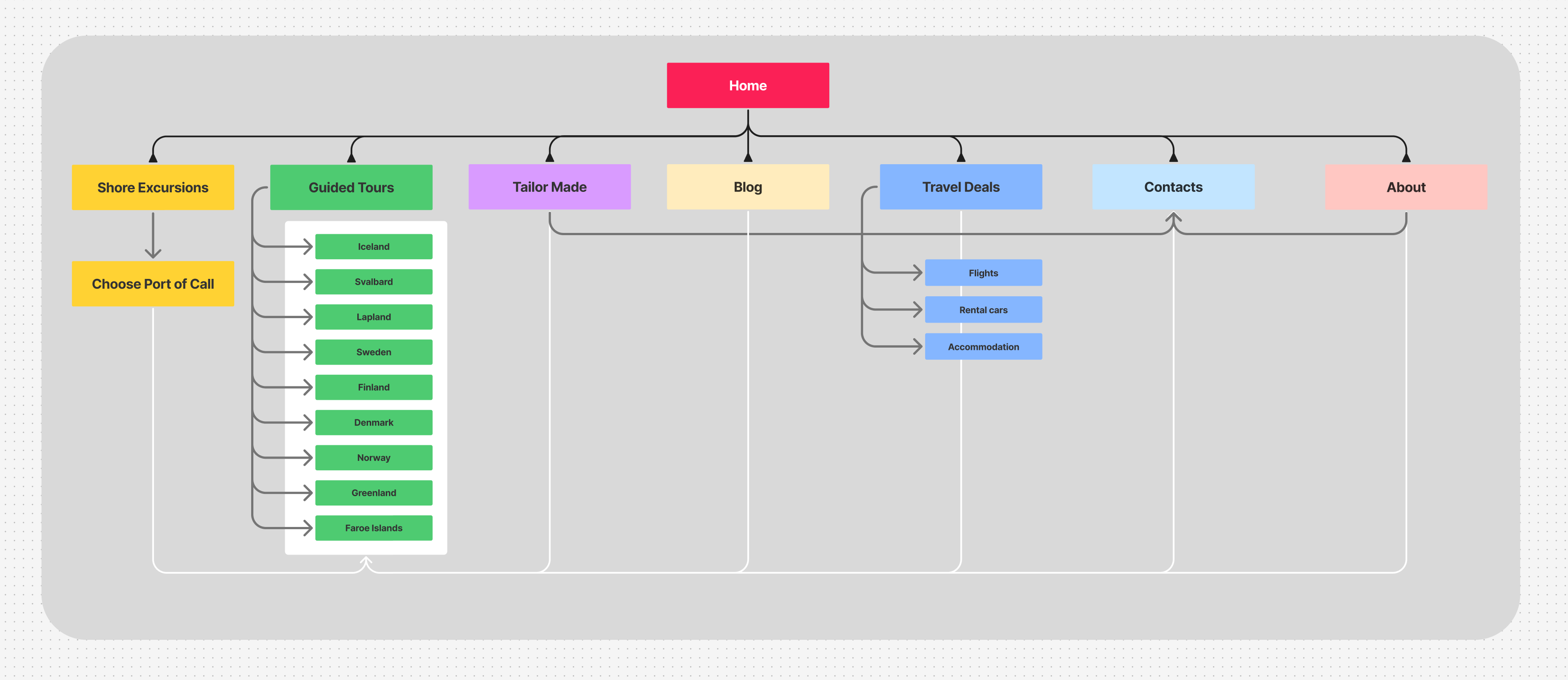

Other sections were included, such as the Blog, Travel Deals, Contacts and the About section. All those sections were built to lead towards the marketplace as well.
Responsiveness
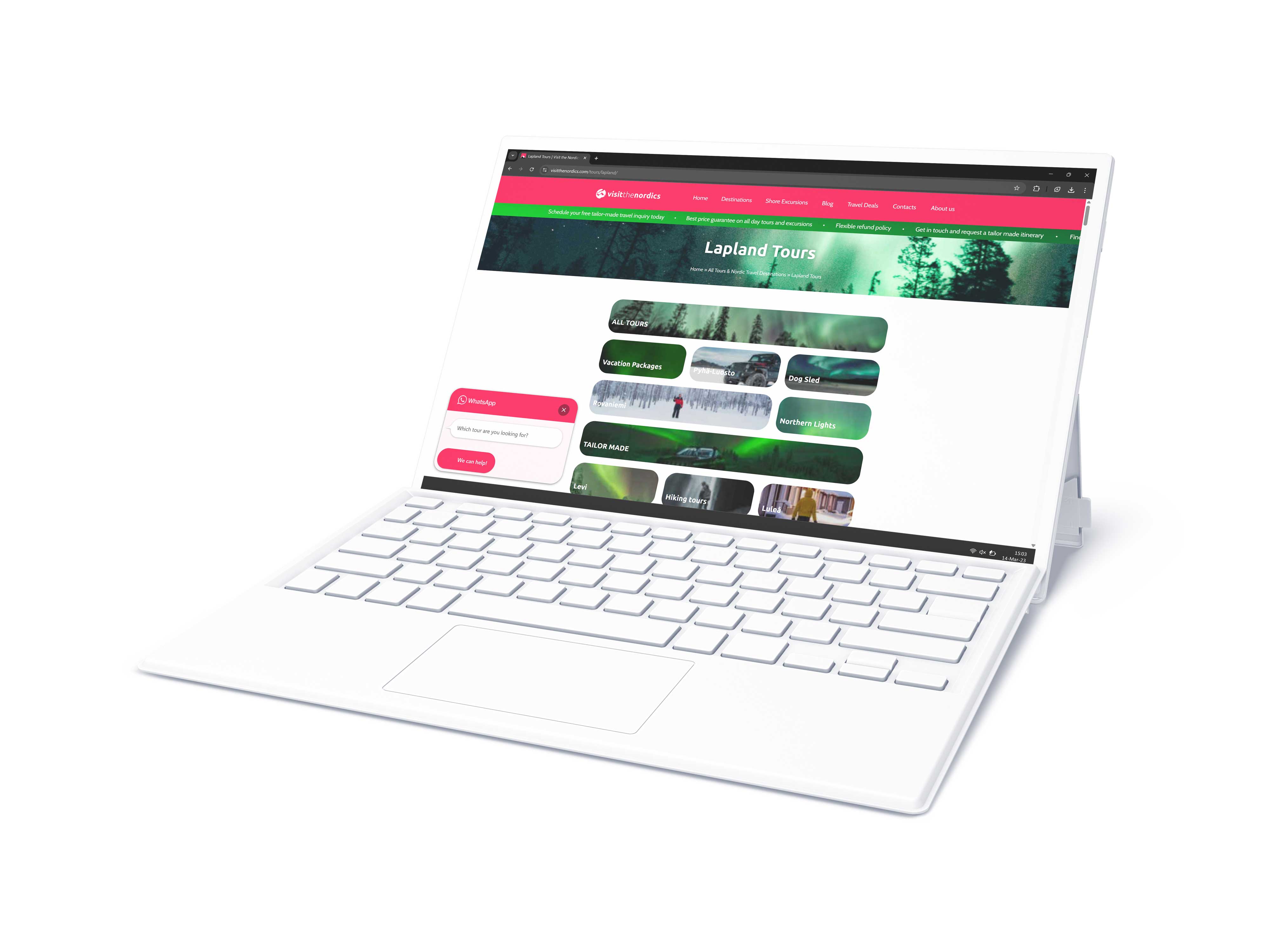
The website was built from larger to smaller screens, making use of graceful degradation when adapting to smaller screens. While adapting to other resolutions, new design solutions were found based on Google Analysis usage data insights.
Booking System
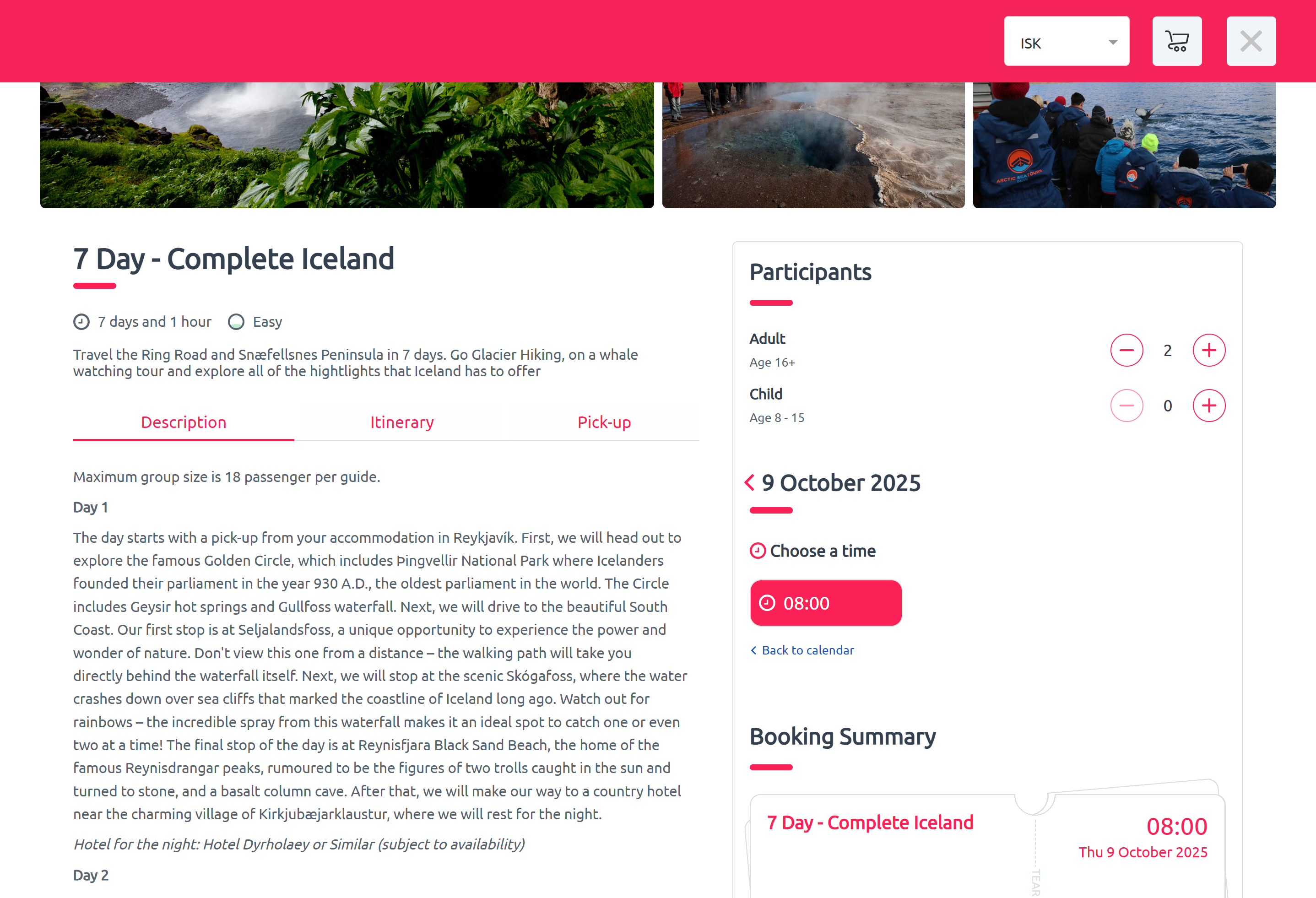
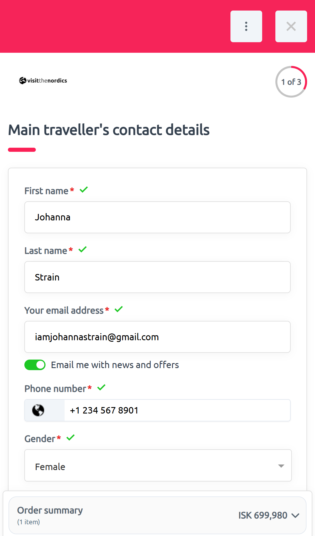
Even though providing their customers with tailored itineraries, Visit the Nordics offers the possibility to book activities, flights, hotels and rental cars and in all of the Nordic destinations.
But the Booking System had a standard feel which didn’t match the brand. Luckily, customization features were available through the use of simple CSS code, which allowed me to modify the look and feel of the booking platform to match the Visit the Nordics website.
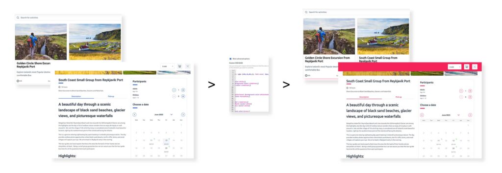
Please click the image to enlarge.
Fonts and colors were updated to match the brand’s needs, providing a more consistent branding.
Brochures
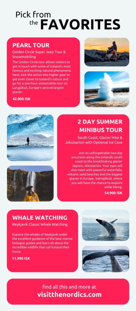
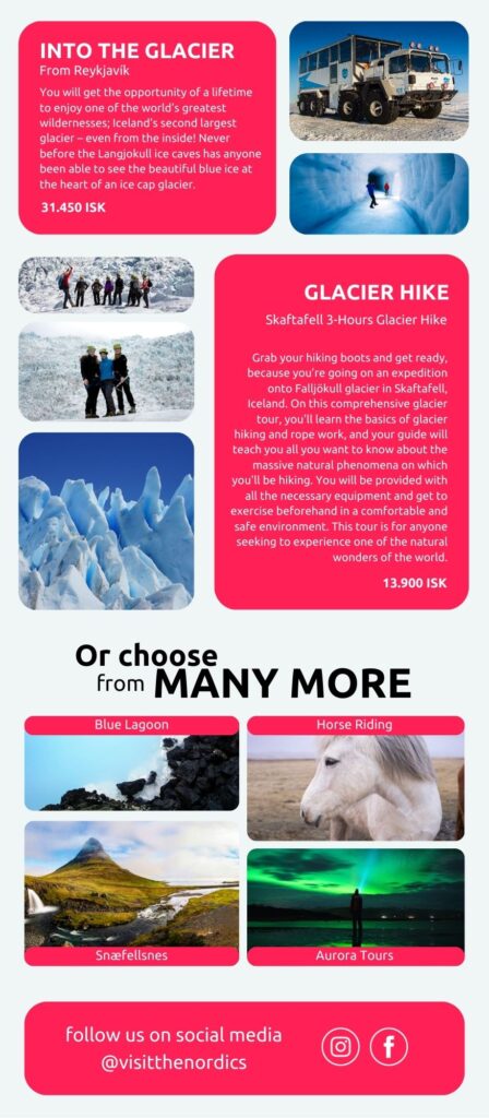
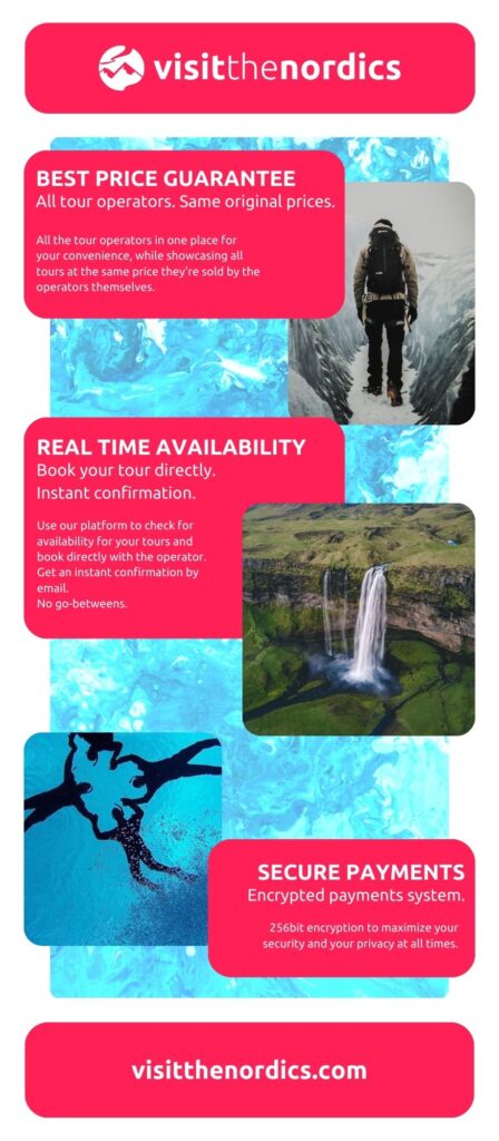
In order to advertise locally (in Iceland), a brochure was designed and printed. The main objective was to leave it at brochure stands in hotels all over the country.
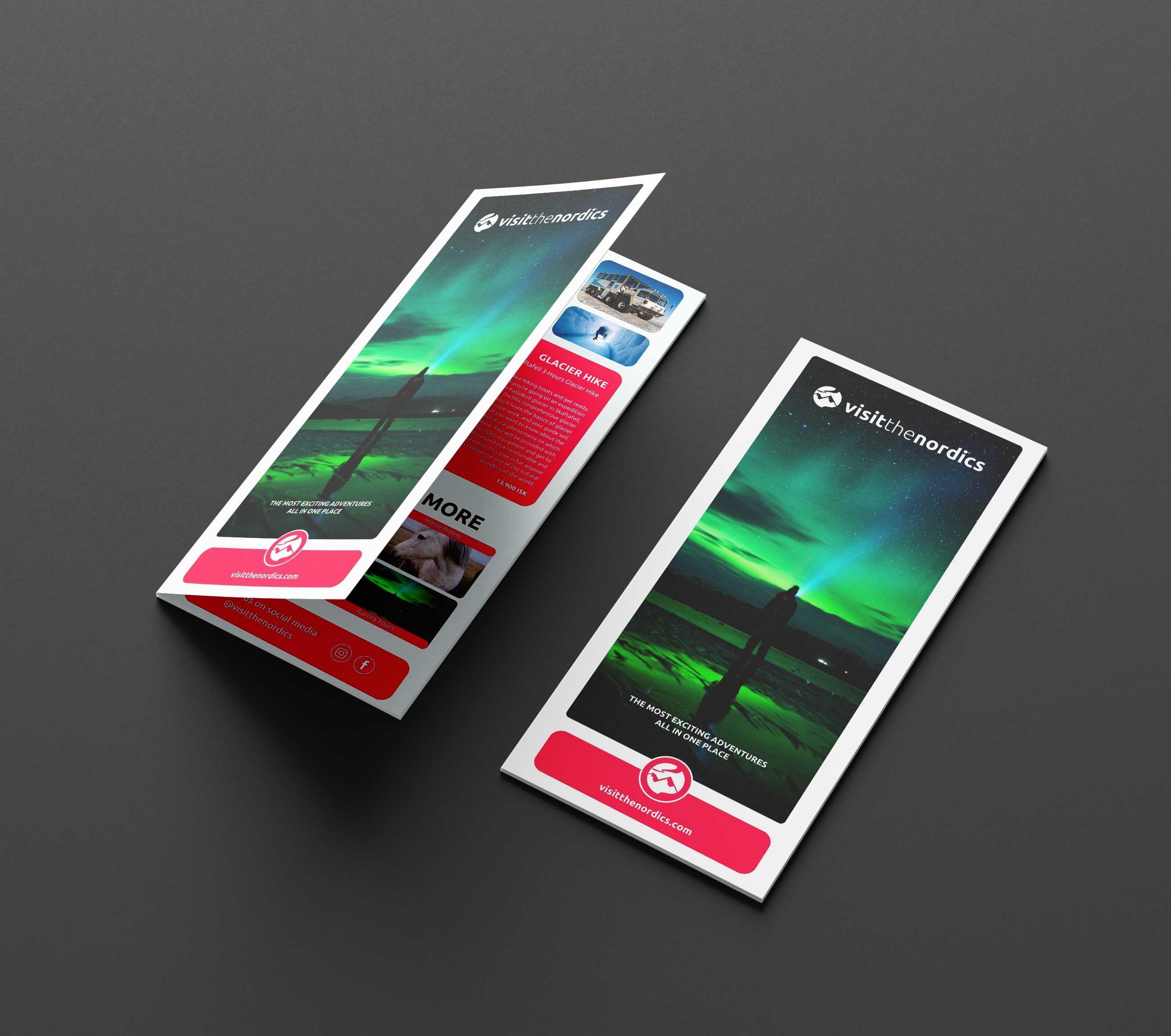
The brochures feature a selection of best-seller tours, other popular suggestions, and some of the company’s highlights, as well as references to their website and social media channels.
InstaStories
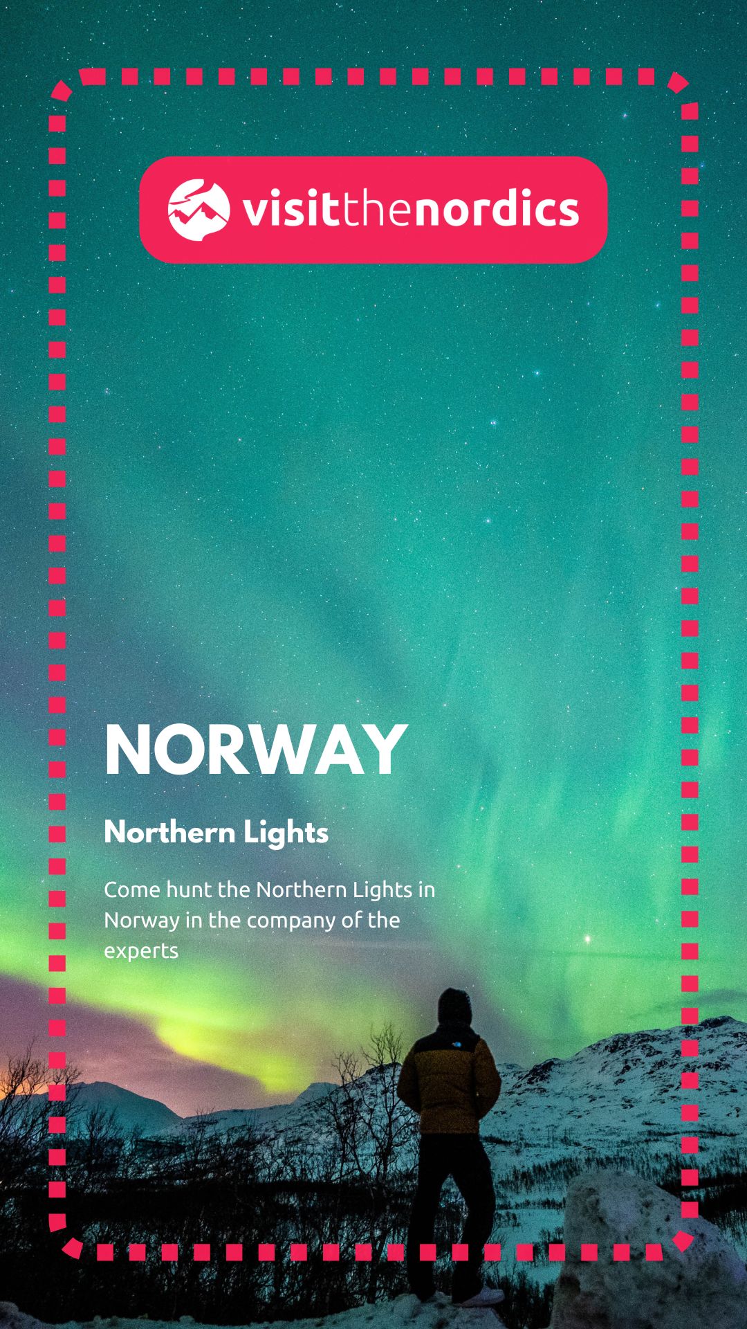
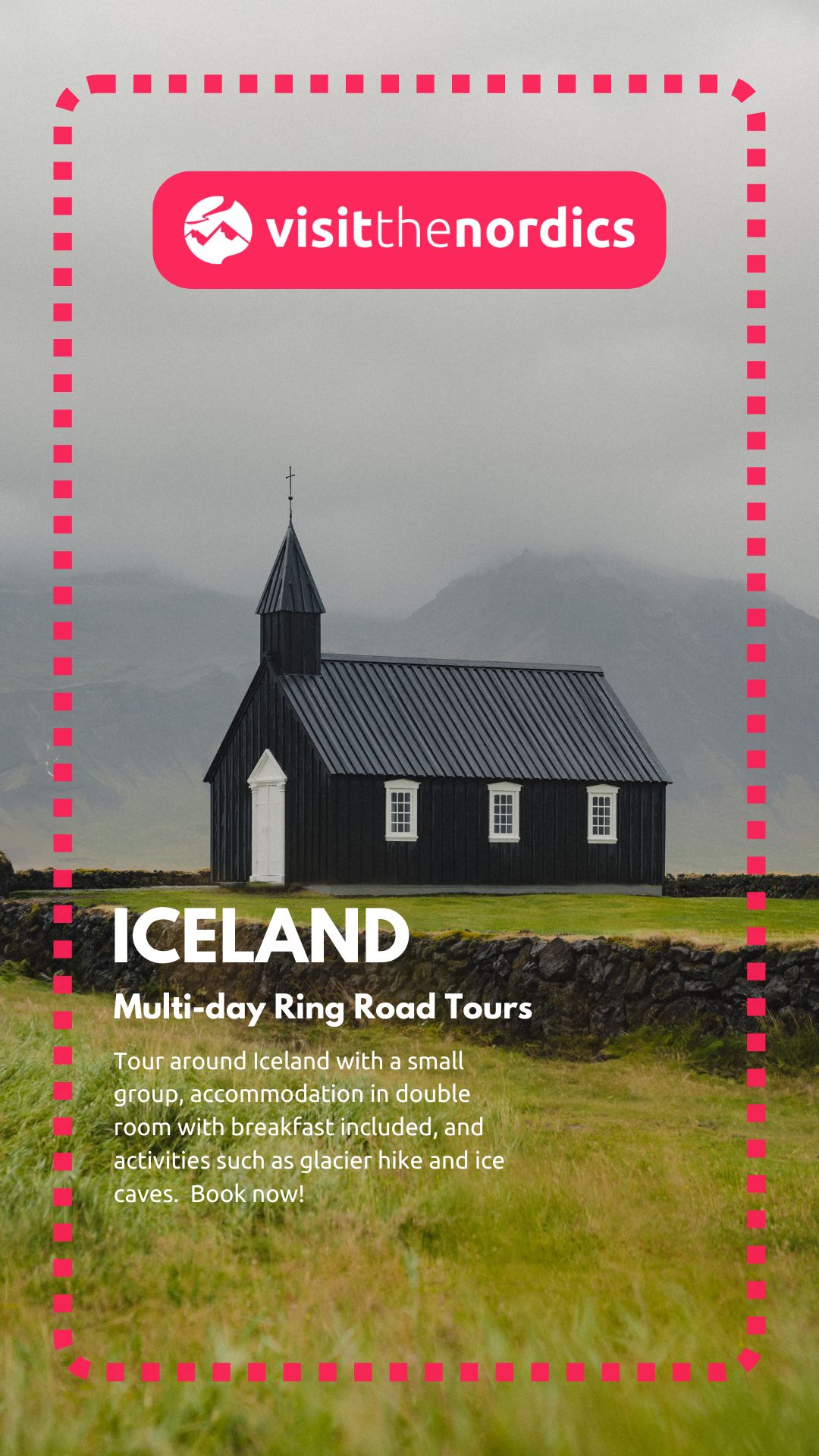
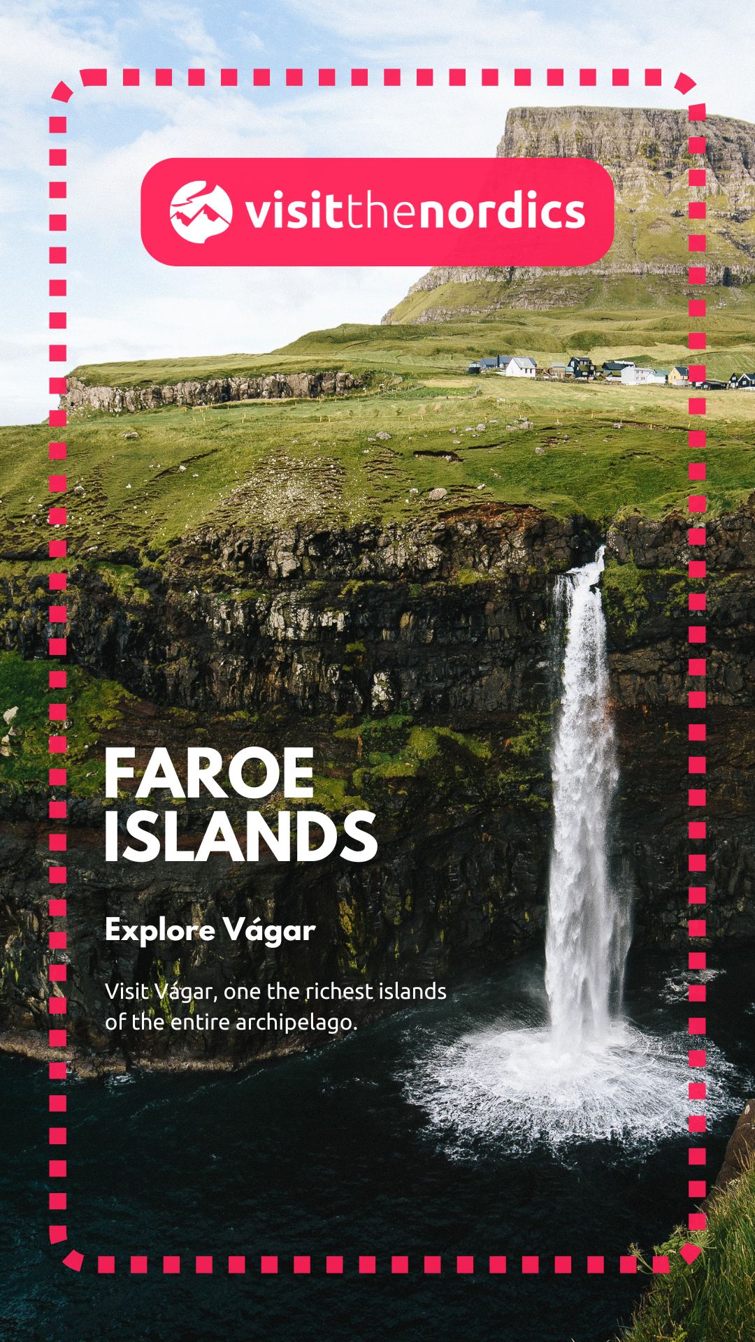
Faroe
Facebook Ads
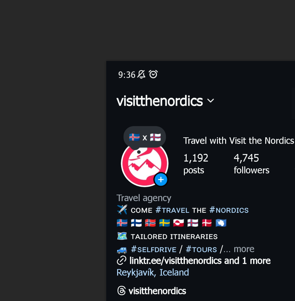
Social Media Profiles
I am Jaime.
Get in touch for work inquiries.
hello (at) jaimemasc.com
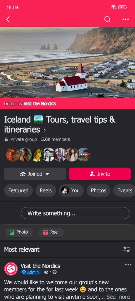
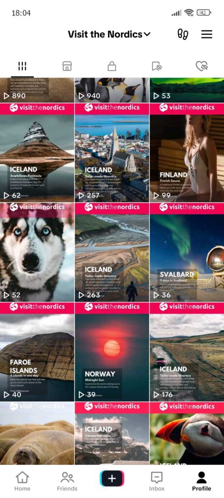
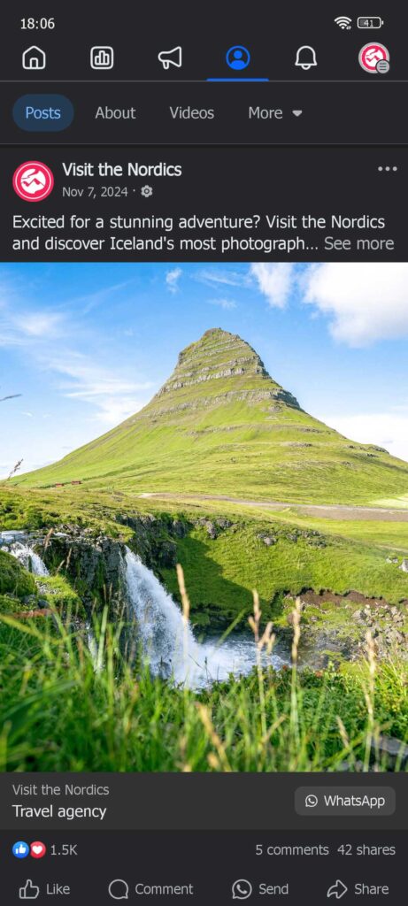
Social Media
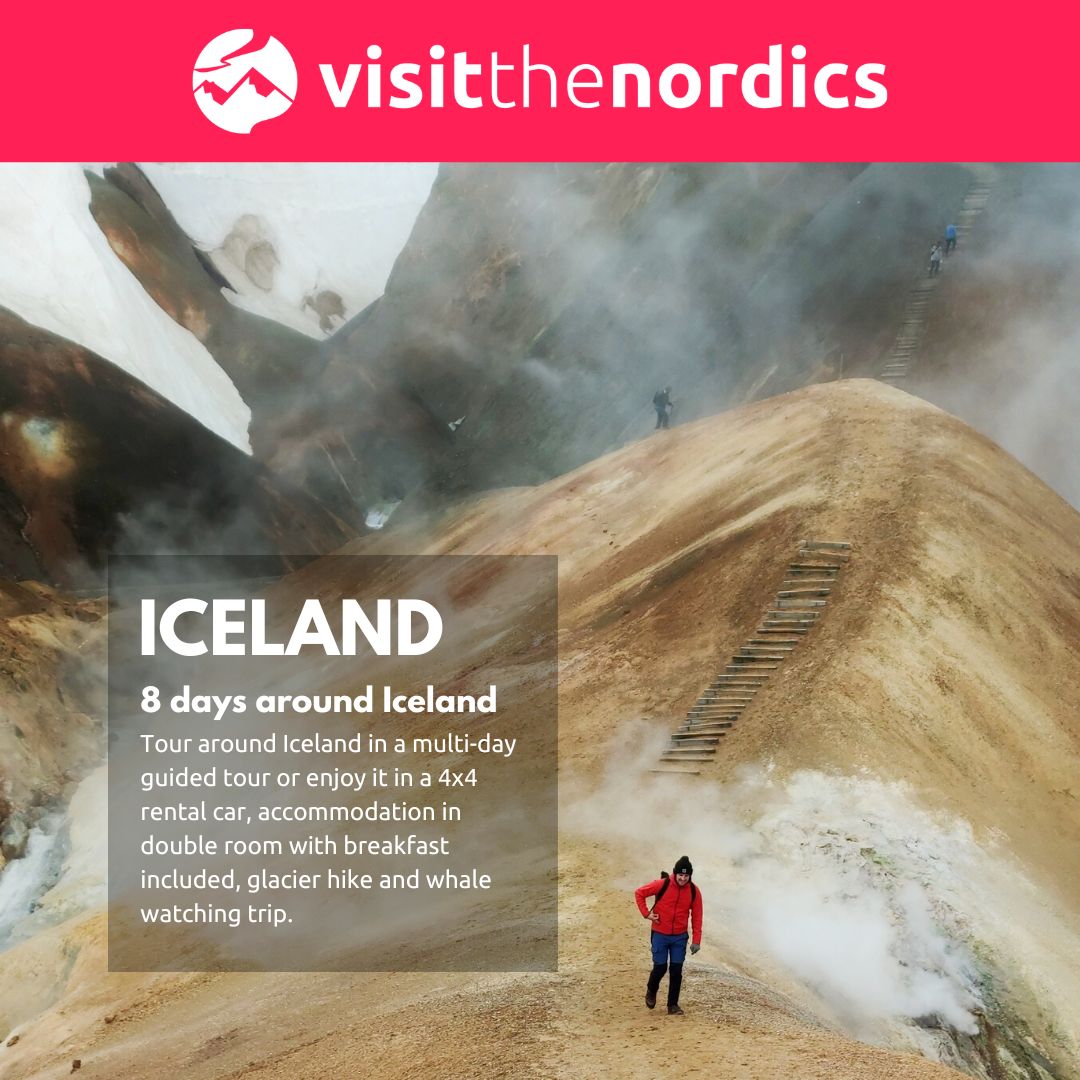
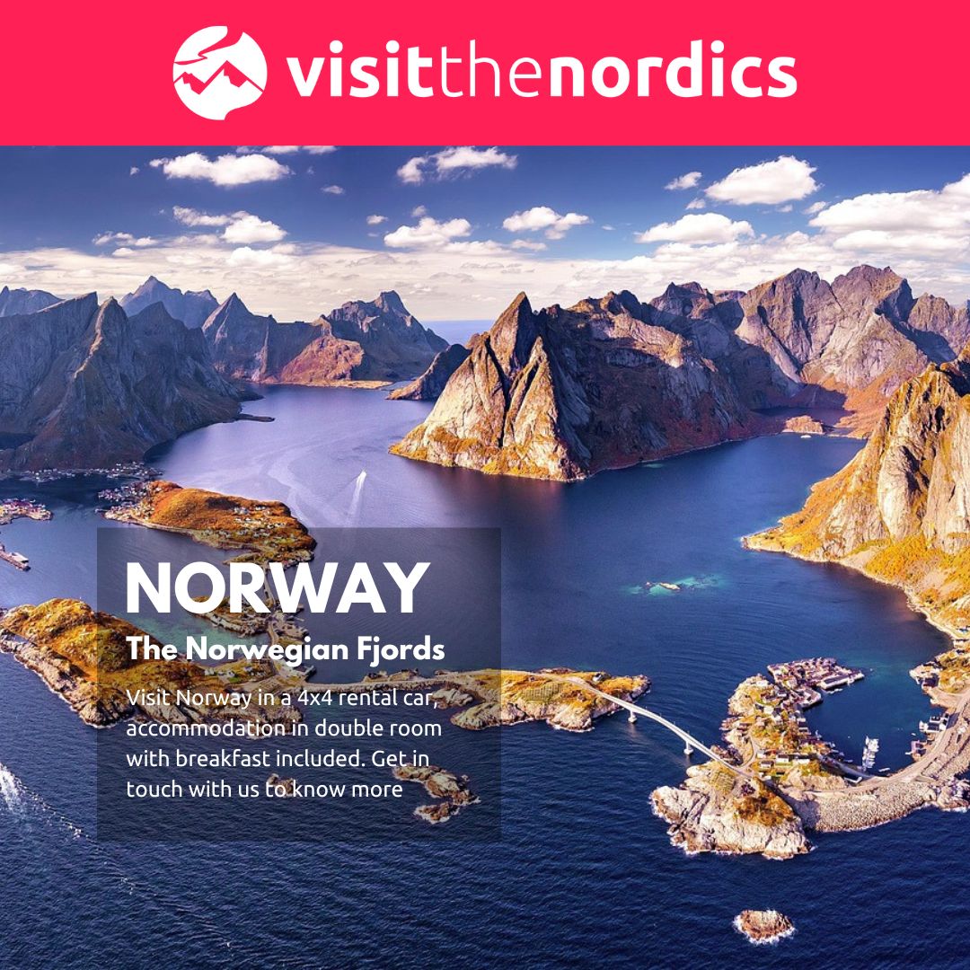
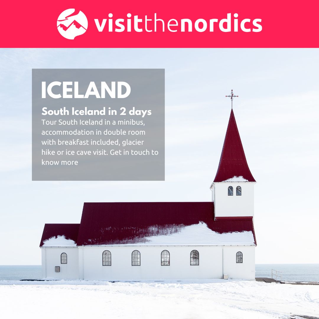
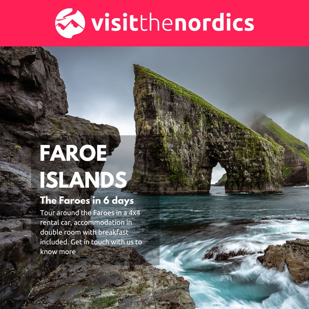
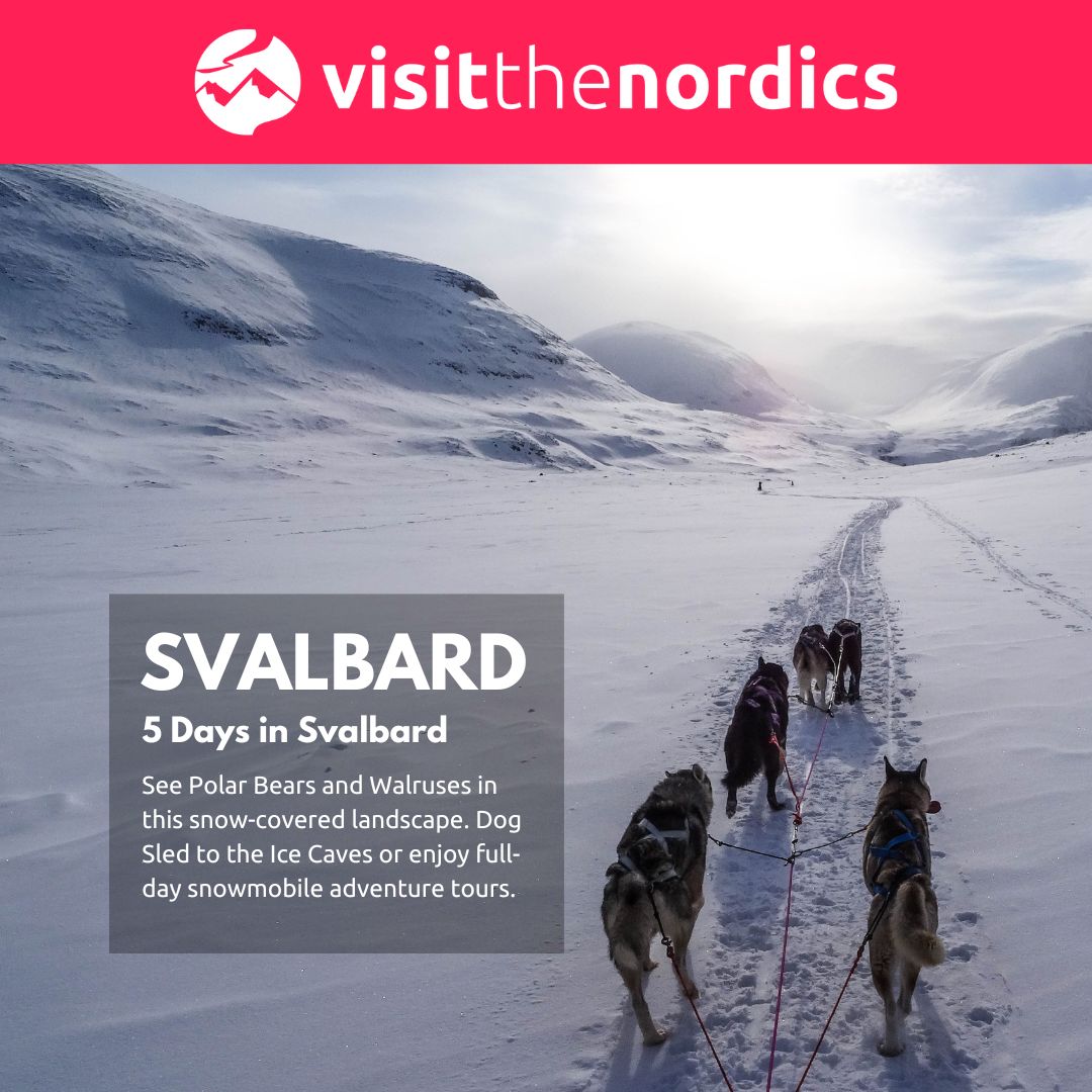
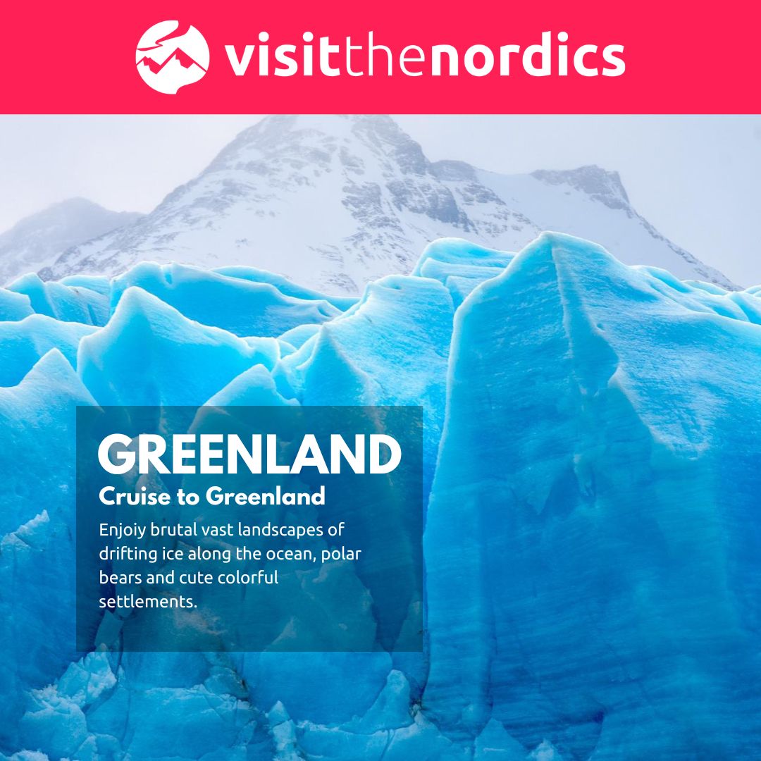
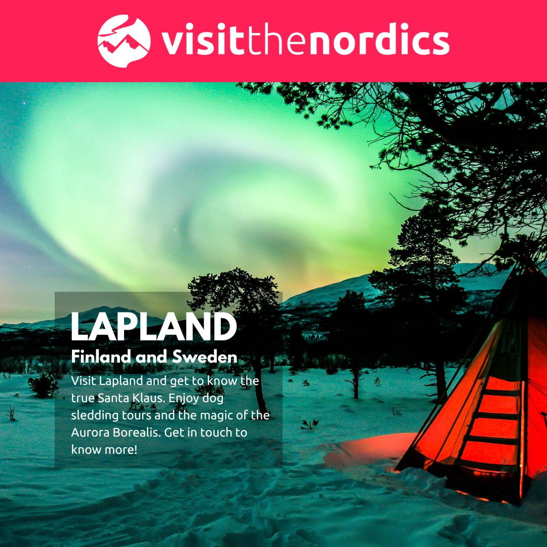
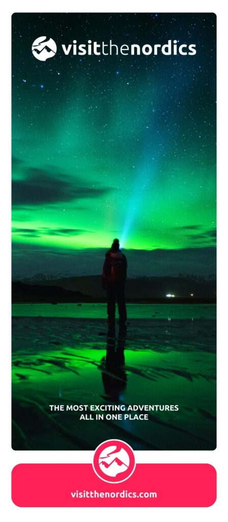
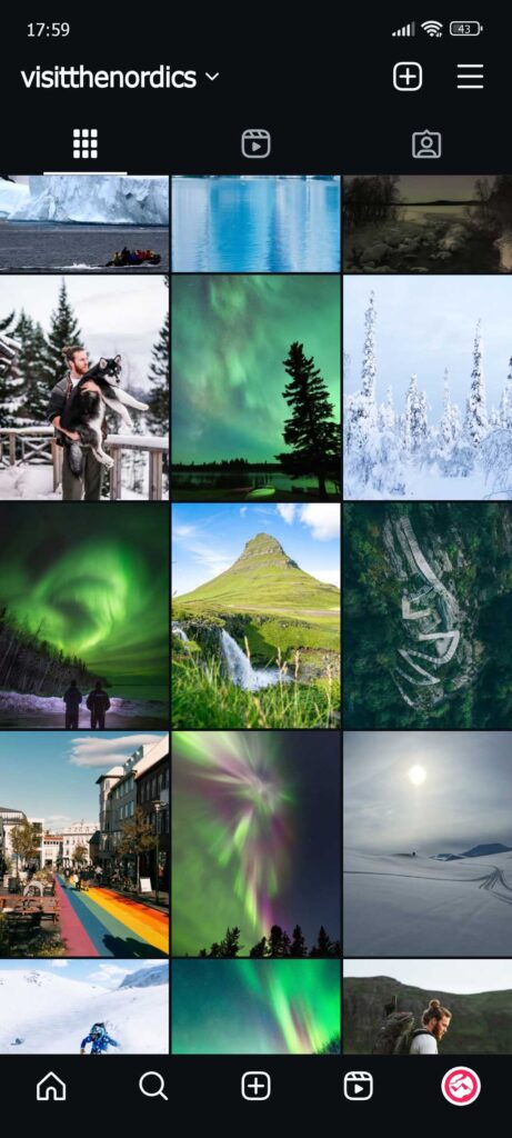
Different formats of social media content were created for posting, from square-shaped ads to the long-sized Instagram and Facebook stories. Consistency was the key element.