Jamming
UX Case Study for the Jamming app – an app designed to connect musicians, bands and venues on a local level.
A quick market study revealed musicians often have troubles finding other competent musicians to join their bands on a local level.
Connections happen locally, usually during events such as small gigs. Word of mouth and information scattered over social medias and a website here and there – and a small dash of magic and luck – brings musicians together and, luckily, they’ll perhaps be a good fit, form a band, make some music and succeed.
That’s where Jamming comes in.
Exploratory Research
A short survey directed to musicians was created and applied in order to understand their pain points. The main research goals were to understand:
- How easily can musicians connect with others?
- Where and how do they advertise their upcoming performances?
- How do musicians assess each others music skills, competences and styles?
- How are bands formed and how volatile are the bands’ formations?
Research and Ideation
Keep reading for the full process or jump to any of the following sections:
User Statements
After conducting research which resulted in a large body of information, the data was organized in the form of User Statements for a better understanding and addressment of the user problems.
- Musicians often have trouble finding other musicians to play with
- Bands often have trouble finding musicians which suit their objectives
- Information about gigs, events, and venues is often scattered a bit all over social media
- There is no social network to connect musicians, patrons, producers, venues and fans
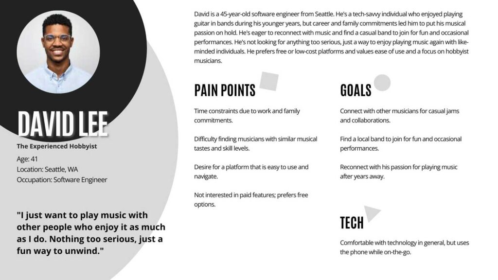
User Persona
A typical User Persona was created based on the insights obtained from the User Statements.
Issues to Solutions
The User problems and pain points acted as a trigger to start the creative process. The User Statements were then rephrased into “How could we” questions:

First Concepts
To understand what the possibilities were, the first paper sketches were drawn.

User Story
Based on the information collected, a User Story was created.

User Journey
To create empathy for the users and their goals while also revealing potential for improvement in the user experience, a User Journey was developed.

App Design
Keep reading for the full process or jump to any of the following sections:
Information Architecture
In order to guide the design process and make it smoother, an Information Architecture plan was then crafted. Information architecture (IA) is, like a blueprint, a visual representation of the product’s infrastructure, features, and hierarchy.

Low Fidelity Prototype
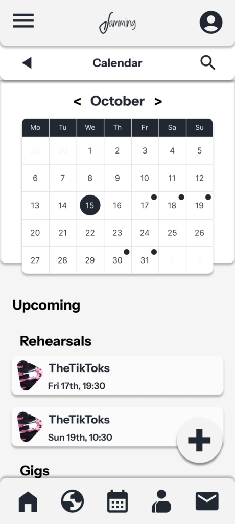
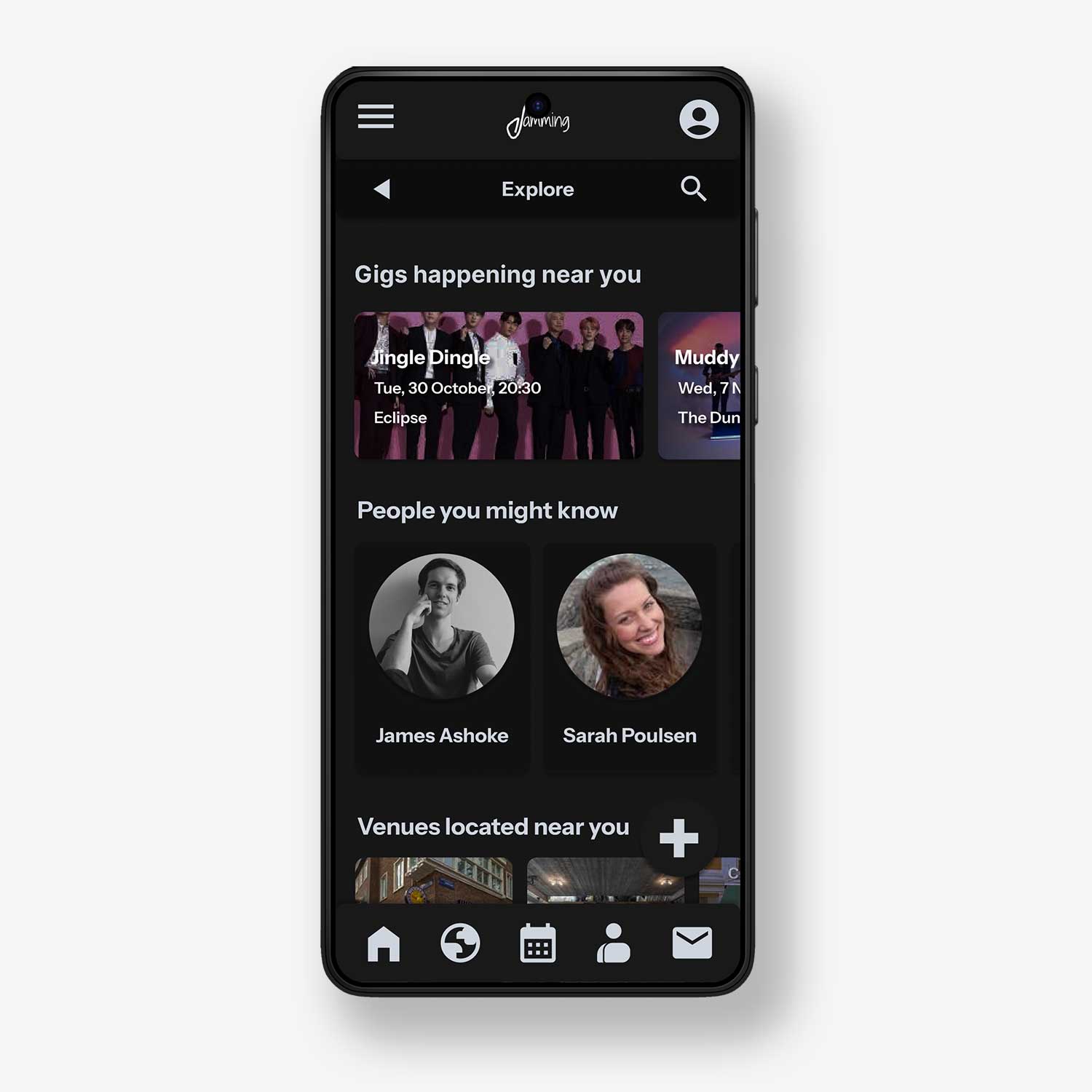
After iterating on the lo-fi prototype, an initial user flow was outlined in order to understand which steps the users needed to perform in order to complete their main tasks – create and edit their profile; explore and connect with other musicians, venues and supporters; schedule events in the calendar such as gigs, jam sessions or rehearsals; send messages to other people.

Design Iteration
Two different design options were considered. The first – yet abandoned – one, had a more “paper feeling”. It was abandoned due to a design inconsistency between the overall style and the way the menu bars interacted with it.

The first designed attempt was used as a starting point and then replaced by a simpler yet versatile design, focusing on accessibility and ease of access.
Sticker Sheet
A final and consistent design was achieved. The design elements can be easily traced in the Sticker Sheet below. A full-resolution view of the image can be accessed by clicking on it.

A Dark Mode version was also crafted in parallel.
High Fidelity Prototype
Welcome to
Jamming
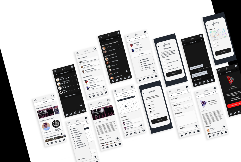
Please click the image to see a full-resolution version.
Design Principles
Accessibility
The choice of colors had in consideration an appealing and smooth design while keeping in mind the high contrast between readable elements and the background. It assumes musicians are visually impaired and it assumes they are able to use their hands, but it considers the fact some users could possibly suffer from daltonism and/or have ADHD. Hence, the layout is simple and direct.
Familiarity
The iconography is nothing short of familiar. An envelope for messages, a globe for the explore section, a calendar for the calendar and scheduling section, a plus symbol for more. The app design considers musicians are busy and constantly on the move, and provides them a simple interface to simplify their most frequent tasks.
Simplicity
In design it is important to know where, when and what to give up. The app could have additional functionality, but it is tailored to serve a singular purpose – creating a local professional network of musicians and people related to the music business.
Easy to customize
The onboarding screens are designed to allow the musicians to build their profile intuitively and in a complete manner even before starting browsing other artists, venues, bands and supporters. Once the onboarding is complete, the app is ready to use.
What I learned from this
Iterate.
Assumptions are good for nothing. Even after the initial exploratory research and the definition of the low-fidelity prototype, there was the need to contact potential users again in order to understand what could be improved in the design. The PLUS button idea came out after a few testers pointed out that creating new tasks could be more accessible.
Color contrast makes things easier.
From the initial design idea to the last, contrast was increased by using brighter backgrounds and darker fonts (and vice-versa), creating a very straight-forward interface which enhances accessibility.
Wide audiences.
A project can be broader if focusing on several tiers. Jamming was initially thought for musicians, but with dedicated areas for venues, producers, and even supporters.
What can still be done
Better filtering system.
The browsing and filters system can still be improved, perhaps by adding different filtering options.
Free x Premium version.
The initial idea to be tested was to allow subscribers on the free version to browse based on their current location, without filtering, up to a certain number of profiles / and to allow paying subscribers to choose where to browse, filtering by instrument, experience, etc., without number of profiles restrictions.

I am Jaime.
Get in touch for work inquiries.
